
“I am a quote factory. You can cite that.”
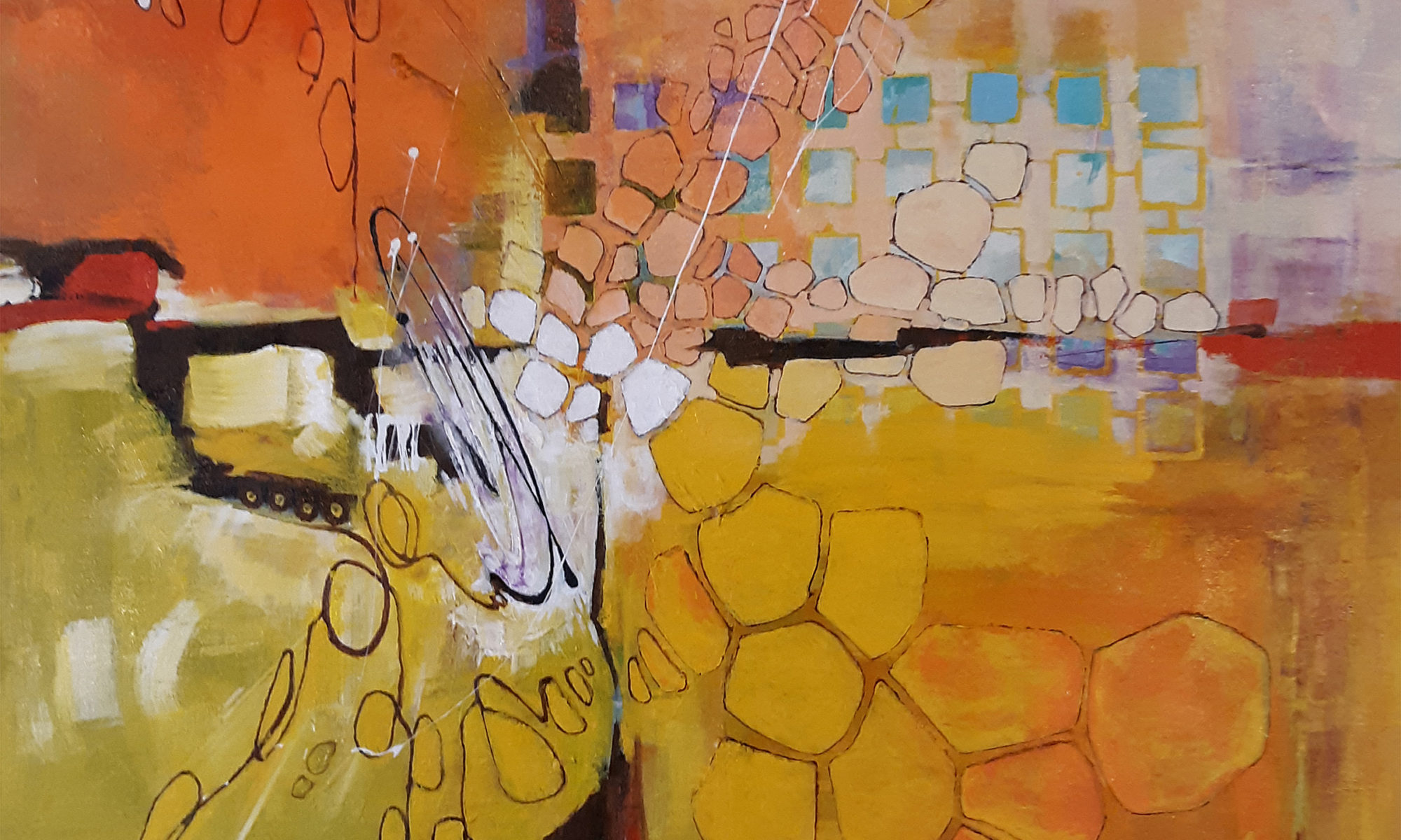
The original title of this painting, the next piece in the MOD! series, was “Remembering My First Box of 120 Crayons”, which was spot on as far as what I wanted to say, but was entirely too long and bulky for presentation on the internet. Rule of thumb for our digital attention span, “shorter is better”.
In this piece, a more muffled color scheme was used. Muted teals and coral pinks replace the pure cadmium reds and oranges. But… who cares about my feelings on salmon, ochre, and ecru, right? I think I need to change my direction in these blogs. Let’s get a bit more playful.

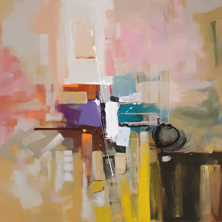
I’m not sure this painting was made for a museum. I’m not really sure ANY of my paintings will ever end up in an art museum. A lot of artists paint for that sort of thing. I’m glad they do because it’s a dirty job but someone has to do it. I don’t have the money right now for supplies, nor the space, to allow me to paint really large, almost overwhelming paintings. I paint for my living room wall. Really. The scale, the style, the colors, are all intended to hang above my sofa and make the droves of people who visit me in my home/studio/mostly-home say “Dude! That looks like art hanging over your davenport!” Okay, not really, I rarely entertain and nobody uses the word davenport. But, I am serious about painting for my living room.
I wanted a “pretty” painting with this one. Trends come and go in the painting universe. I remember when I first took a stab at “practicing artist” in the mid 1980s, every painting you’d see had pink, mauve, and grey in it. I surrendered to the trend because, well, I wanted to actually make some money from my painting. “Pretty”, however, seems never really to go out of style. The problem with “pretty” is everybody seems to think they are a freaking expert on what pretty means.
With this painting being loosely based on childhood memories and needing to be pretty, I got all philosophical on crayola crayons. As a kid, drawing is great, but nothing compares to the way-much-cooler-ness of a colored world. An entire multi-million dollar industry revolves around kids, AND ADULTS, satisfying themselves by adding color to black and white images they didn’t even draw. So what’s so philosophical about colored crayons? How about this. A drawing, say graphite on a white piece of paper, is said to exist in 2 dimensions. While it can be argued that the deposit of pencil marks, no matter how tiny, is still adding another dimension to the 2-D length and width of the paper, so really the drawing is already 3-D, but that makes what I’m trying to convey more difficult, so pretend I didn’t mention it. The adding of color to a 2 dimensional black and white drawing makes it somehow much larger, much more alive, much more exciting to view and engage with. Does adding color to black and white drawing add a “dimension”? I’d say it does. However, that kind of flies in the face of my understanding of just what dimensions are. If adding color to black and white is not adding “dimension” to the piece, what in the hell IS it adding then? And if adding color to something that is black and white is not that magical, what’s all this hullabaloo over colored motion pictures? And speaking of movie magic, is adding sound to silent films also adding dimension or whatever it is that’s making black and white stuff awesomer? Philosophical enough for you? It is for me.
In conclusion, shorter equals better, pretty colored paintings are bigger than black and white drawings, crayons are cool, and art looks great hanging over davenports.