
“Is a painting’s title important? Ask the painting.”
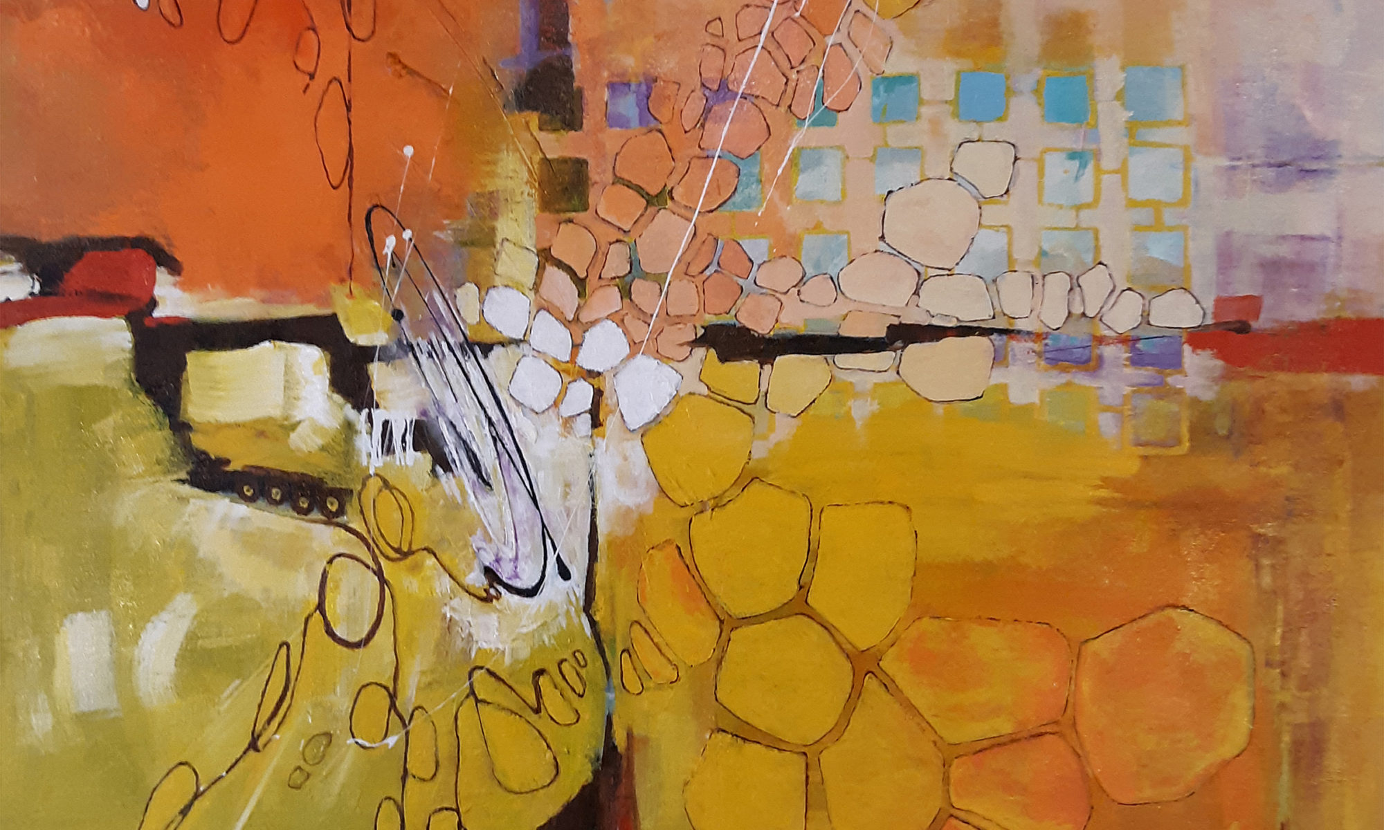
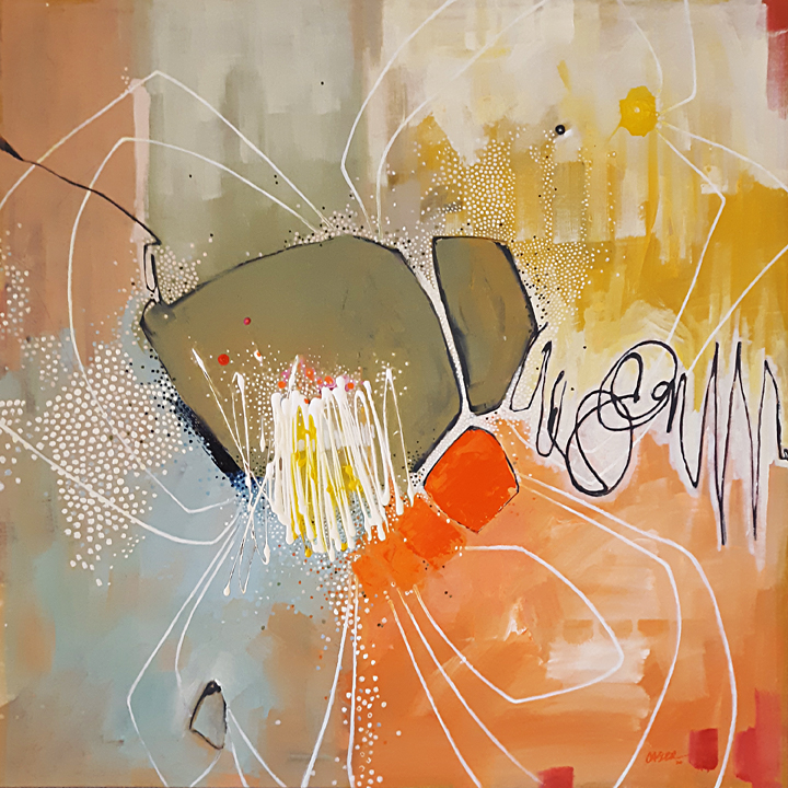
Never quite knowing when to stop, I explored my newly acquired “skills” of doodled line work and dots even further in the next piece of the MOD! series. After laying in the initial composition and applying a wash of preliminary color, I needed a design element to counter the drab black of the linear framework, so I took a small bottle of white paint and hastily scribbled a shape near the center of the piece. The new element ended up having small ball like tips with thin semi-straight lines connecting them. “That looks like a bunch of Q-Tips”, I thought. Heyyy, I had half of my title. But half a title isn’t an entire title, so I needed more. What is special about Q-Tips? Certainly not what they are used for, which is just about anything. Their shape? Their color? Not exciting. What if I placed the Q-Tip in a hostile or a non-Q-Tippish environment? What if Q-Tips were alive? What if I MADE Q-Tips alive? What if they were not only alive, but growing? What if they were not only growing but they were flowering? Perfect. I had my full title, “My Q-Tips Are Blossoming”. A little weird, but kind of funny and certainly on the thought provoking side.

The color scheme would be loosely based on a Maxfield Parrish poster from 1930. While Parrish was most certainly NOT a “modern” painter, I’ve always been fond of his use of sky blue and orange. That color combination and Parrish’s use of it has stayed in my memory from my days at Art School (School of the Art Institute of Chicago, I’m such the name dropper) back in the early 1980s. Funny how some things imprint upon us so strongly. I must have been really smitten by Parrish.
The application of the dot highlights took longer than I expected. While many artists use paint pens to make their dot patterns, I wanted to use a small brush better to control the size and shape of each and every dot. That might be giving my concentration a little too much credit. I’m sure I wandered off a few times to think about important stuff like Arsenal games and new releases of dubbed Anime. So I’ll rephrase that and say I wanted to control the size and shape of most of the dots. Some I just didn’t give a shit about.
The addition of the white linear “petals” was the last piece of the puzzle. I wanted to surround the large shapes in the center and turn them into an abstracted flower. The white line brings the entire surface back into play, allowing the more prominent shapes to stretch out toward the edges.
“My Q-Tips Are Blossoming!” is a playful interpretation of what my idea of a “modern” painting is supposed to look like. It has areas of expressionism, a peculiar geometry in other places, is bright, and has a slight attitude. I wonder what will come next?