I’ve two close friends who are color blind. A condition like perdition for the rainbow loving kind. They lost their reds in a battle with god. An angry bitter god best described as Lord of Orange
(door hinge was suggested as an apt and worthy rhyme)
who forages for hues from unsuspecting unborn dudes. Seems an unfair fight. A fetus maybe flips a bit, but doesn’t really pack a punch, a hunch, just sayin’, perhaps, and possibly maybe orangey lord should pick a fight with others of his own size and saturation. And maturation. Carefully sayin’, while I’m certainly not yellow I can’t piss off the fellow. For I like seeing green and he takes those too. So blue in discussion with my redless greenless friends aint the same blue between me and those two. Or is it? Only god knows for sure? Purely speculation and for your consideration is the notion it is possible that we can still communicate our mutual misunderstanding politics of beige or gold our feelings on what’s tan or sand or even shades of indigo,
(whoa! indigo is a touchy topic don’tcha know)
without the finger flipping trolling others late at night when it’s easy spewing hatred when there’s nada chance for fight. Or are we fated, hueless and the folk of color fisticuffs with each other social media bomber pilot billion lives lost to violet?
I’ve two great friends, both of whom are color blind.
Success, by any measure, is a tricky task best left to experts.
Experts in their field of experting, and lecturing, pontificated expertality on why you’re not successful. In their expert opinion of course. You more than likely lack some goals.
Experts love goals.
Experts on success will tell you goals will get you what you need. To be, or not to be, successful.
But write them down.
I guess goals don’t work, unless they’re written on a card, that you can flash, in your face, to remind you, you aren’t successful yet, a face flash-card for failures.
The definition of success, according to the internet, which is my source for all things true, and good, and beautiful, seems to me quite simple.
“the accomplishment of an aim or purpose”
So failures, if you feel like one, don’t know how to aim. Or have a purpose. Big fat aim flailing purpose lacking people aren’t successful. Sounds a little harsh.
But I’m no expert.
And certainly not judging. I’m arting, starting to see, for me, success and failure, states of mind, I find at times my latest piece of which I’m fond falls flat when faced by viewers.
How can that be?
At other times a work that sucks or not my best, some will attest, is possibly my strongest piece and passes test, from vest they pull their checkbook. And open it. A painting purchase. There is no stronger proof they like it.
Must be success?
A mess addressing what is fail, success, redressing sweet travail that finds itself on others’ walls or hanging in their dressing halls, I excerpt…
“Fluffy Stuff” – 16×16 Acrylic on Board – More detail
“Pretty is not as subjective as you think.”
Snaps!
When fireworks BLOOM! my mind spews OOH! I can’t stop singing to a snappy tune, goats on the internet piano playing puffy kittens penguins at the shopping mall wait a minute that’s not all, wombats kangaroos I always watch koala chews my humor sometimes makes me laugh at CNN concocted news, little baby elephants acting tough in front of mom double rainbow’s beautiful after stormy comes the calm, drinking coffee afternoons toasting bourbons with the moon, on my deck, in the summer, Buddy Rich was quite the drummer, Jazzy when it’s not too weird I even like that Richard Gere unless it’s true there was this gerbil fabricated foolish fable? Watership Down, bunnies can be brutal, never tasted hasenpfeffer but i surely dig the strudel, NHK World, Japanese are tidy, bonsai on my coffee table thinks it’s somehow mouseful mighty, Anime nights, loving what I’m seein’, wait a minute, what is this? God of High School is Korean? And breathe. I like air. It can blow both hot and cool yet no one thinks it’s just a tool And breathe. As curtains fall they always do, I’m often reminiscing over me and you, but this isn’t penitence or hesitance to tell my tale of happy trails to you and me of things I feel make life worth living, gifts of joy and joy of giving, hurtful bondage not for me, I’ll purple mountain majesty and fruited hills of thee I’ll sing, playful puppies fived gold rings, constables and guys named sting, watermelon seeds I spit on pendulums without their pit and favorite authors books I’ve read to daughters drowsy heads to bed and naps of sixty minutes spent well never fearing paying rent, while arrogant at times alas, and even able as an ass, though I pretend I’m cold and rough…
I can’t get enough of that fluffy stuff.
Snaps?
“Fluffy Stuff” – 16×16 Acrylic on Board – More detail
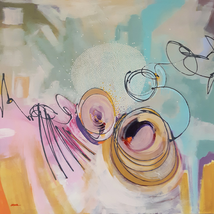
“Centurion Mitosis” – 36×36 Acrylic on Canvas – More detail
Centurion Mitosis Video
“Ars longa, vita brevis!”
And even more MOD! poetry. I’m a natural. This is the last of the MOD! pieces I’m posting.
Snaps!
A Centurion goes where Centurions go, but along the way he yells “Hey! Yo!” with his Latin accent and his bristly hat to an unsuspecting plebeian out walking his cat. This common man and his common pet, both on a stroll to the common vet, stopped quite abruptly, and turned their heads because “Yo” as a wordn’t been invented yet. “Who me?” asked the man, “Meow meow?” asked the cat, “Yes you!” said Centurion as he pulled out a rat. The rat had been soldier snatched foraging for food unfortunately situated in the officer’s snood. “Thought you could use this!” the Centurion wailed as he flung the fetid rodent flipped firmly by its tail. “Oh my!” mewed the man, “Meow meow!” spat the cat, as the rat, as it splat on the commons, shat. With that went Centurion off to the place where Centurions go when they just gotta go while the man and the cat just stopped and sat by splatted shatted rat and what’ll we do with that? “Meow meow meow meow!” meaning “I aint eatin’ that!”, yelled the cat who was common in a very common spat. “I know” agreed the man who pretended comprehending of his common cat’s tongue with his common understanding.
The moral of this story, the lesson of this tale, self-perceived kindness can sometimes be a trap, for what you feel is generous might be just a slap. Or even a pile of crap.
Snap(s)?
I know what you’re thinking. You’re thinking “My goodness, John, how can you be so totally gosh darned and goll dangedly creative?”, in exactly those words probably.
It’s a kind, and generous, gift.
“Centurion Mitosis” – 36×36 Acrylic on Canvas – More detail
“Printemps Radioactif” – 36×36 Acrylic on Canvas – More detail
“Hell is beautiful this time of year.”
Radioactive Springtime. So why the French title? Because it wasn’t pretentious, like Latin. Beaucoup mieux, n’est-ce pas? So since we’re being definitely NOT pretentious, here’s a little “MOD!” color poetry to explain this painting. (Snaps!)
Pinking beige abruptly. Beige blocks pink, it’s what it does. Beige loves brotherly brown, a shared fatherly mother. Viridian oblivion why do you stand alone?
Chartreuse jigs while others jag as jagging jags just aint its bag .
Ecru morphs midas, explodes into gold. Gold tickles teal in its race to the top To find blue building with blue building blocks.
Blue blocks butress pink beware white the buffer But when the heart disintegrates, they all like one another.
(Snaps!)
Okay, I’m no Ken Nordine, but let’s give a huge shout-out to him (he’s no longer with us) because he was quite influential in my younger days. His “Colors” work was some of the most interesting stuff I had ever heard. I was totally mesmerized listening to his late night radio voice word jazzing about “flesh” and “turquoise”, personifying “azure”, spewing on the trials and tribulations of “puce”. Puce? Who in the hell refers to THAT color? Heliotrope? Is “mud” even considered a color? I thought “russet” was a potato. Never heard of “cerise” until this entertaining work of Ken’s.
“Memories of Crayons” – 36×36 Acrylic on Canvas – More detail
“I am a quote factory. You can cite that.”
The original title of this painting, the next piece in the MOD! series, was “Remembering My First Box of 120 Crayons”, which was spot on as far as what I wanted to say, but was entirely too long and bulky for presentation on the internet. Rule of thumb for our digital attention span, “shorter is better”.
In this piece, a more muffled color scheme was used. Muted teals and coral pinks replace the pure cadmium reds and oranges. But… who cares about my feelings on salmon, ochre, and ecru, right? I think I need to change my direction in these blogs. Let’s get a bit more playful.
childhood hopes and dreams light sabres.
I’m not sure this painting was made for a museum. I’m not really sure ANY of my paintings will ever end up in an art museum. A lot of artists paint for that sort of thing. I’m glad they do because it’s a dirty job but someone has to do it. I don’t have the money right now for supplies, nor the space, to allow me to paint really large, almost overwhelming paintings. I paint for my living room wall. Really. The scale, the style, the colors, are all intended to hang above my sofa and make the droves of people who visit me in my home/studio/mostly-home say “Dude! That looks like art hanging over your davenport!” Okay, not really, I rarely entertain and nobody uses the word davenport. But, I am serious about painting for my living room.
I wanted a “pretty” painting with this one. Trends come and go in the painting universe. I remember when I first took a stab at “practicing artist” in the mid 1980s, every painting you’d see had pink, mauve, and grey in it. I surrendered to the trend because, well, I wanted to actually make some money from my painting. “Pretty”, however, seems never really to go out of style. The problem with “pretty” is everybody seems to think they are a freaking expert on what pretty means.
With this painting being loosely based on childhood memories and needing to be pretty, I got all philosophical on crayola crayons. As a kid, drawing is great, but nothing compares to the way-much-cooler-ness of a colored world. An entire multi-million dollar industry revolves around kids, AND ADULTS, satisfying themselves by adding color to black and white images they didn’t even draw. So what’s so philosophical about colored crayons? How about this. A drawing, say graphite on a white piece of paper, is said to exist in 2 dimensions. While it can be argued that the deposit of pencil marks, no matter how tiny, is still adding another dimension to the 2-D length and width of the paper, so really the drawing is already 3-D, but that makes what I’m trying to convey more difficult, so pretend I didn’t mention it. The adding of color to a 2 dimensional black and white drawing makes it somehow much larger, much more alive, much more exciting to view and engage with. Does adding color to black and white drawing add a “dimension”? I’d say it does. However, that kind of flies in the face of my understanding of just what dimensions are. If adding color to black and white is not adding “dimension” to the piece, what in the hell IS it adding then? And if adding color to something that is black and white is not that magical, what’s all this hullabaloo over colored motion pictures? And speaking of movie magic, is adding sound to silent films also adding dimension or whatever it is that’s making black and white stuff awesomer? Philosophical enough for you? It is for me.
In conclusion, shorter equals better, pretty colored paintings are bigger than black and white drawings, crayons are cool, and art looks great hanging over davenports.
“Memories of Crayons” – 36×36 Acrylic on Canvas – More detail
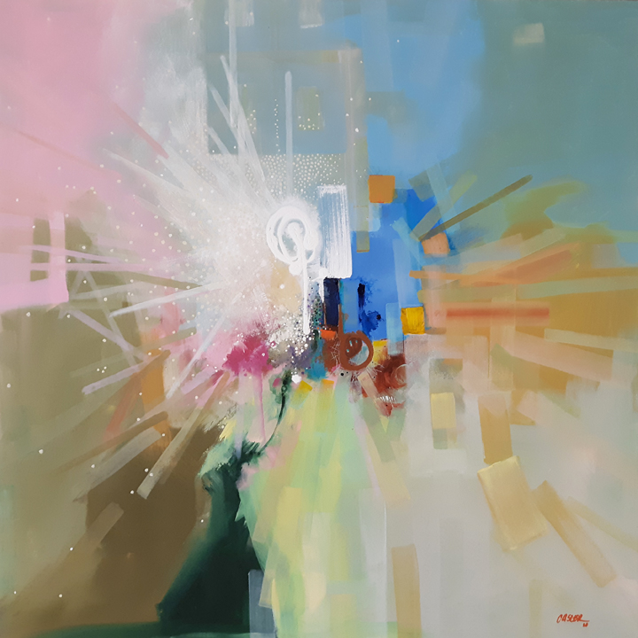
“Salt Water Taffy” – 36″x36″ Acrylic on Canvas – More detail
“Stop looking for snowmen in the desert.”
Art doesn’t happen on the canvas, or on the pedestal, or on a sheet of drawing paper. Art happens in the viewer’s mind. This concept is kind of tricky to communicate, but since most people don’t really care anyway, I’ll just muddle through the explanation and be happy with it.
Picasso is credited with saying “Art is a lie that reveals the truth”. While many interpret this as artists trying to create the illusion of three dimensional space in two dimensions, or sculptors trying to convince us that a marble figure is the actual person of David from the bible, I don’t believe this goes far enough in explaining the art as a lie statement. I’ll elaborate, but first some backstory.
I had the incredible, amazing, (insert any superlative of your choosing here) opportunity to study closely with a scholar named Ioan Petru Culiano at the University of Chicago from 1989-1991. I had enrolled in a unique and special program, Tutorial Studies in the New Collegiate Division, that allowed a student in good standing to create their own curriculum as long as the student could find a sponsoring professor who would be willing to enroll in the program along with him. My long and arduous spiritual journey in short, I wanted to get my degree in Magic. There was no shortage of professors at the University of Chicago that also found this area of research extremely interesting. Culiano was one of these, and was willing to sponsor me.
Perhaps the book I was reading and had along with me in my initial conversation with him helped my case. I was reading Foucault’s Pendulum by Umberto Eco, who also wrote The Name of the Rose (which became a movie starring Sean Connery) when Culiano said, “Oh, I’m good friends with him!” Wow.
Culiano’s pedigree was nothing short of astounding. He was the golden boy of Mircea Eliade, a god of History of Religion, Shamanism, etc. At the time, Culiano held the Chair of History of Christianity. In a later conversation he shared with me his disgruntlement that he wasn’t chair of History of Religion which was held by Wendy Doniger (who was also a student of Eliade) and I remember laughing and thinking to myself “I guess scholars can be just as petty as the rest of us”. But back to that initial conversation, when I happened to mention I was also of Romanian descent and a practicing fine artist, that was that. He must have liked Romanian artists who read Eco.
The point of this backstory is that after hundreds of hours of lectures, many intense conversations with the man, and even an in depth study of his book Eros and Magic in the Renaissance, I came to realize, and to believe, that the world was not only seriously ‘magical’, but that nothing in my world, or any world, exists outside of myself. The entire realm of what’s real occurs within my brain while I look at it, touch it, smell it, taste it, and listen to it. Even that last word, “it”, is deceptive as it hints at something other than myself, something that can somehow exist without my brain thinking it into existence. That is not the cup of coffee that I am holding. That is my brain recreating a scene of lifelike and intense illusion, complete with sensory impulses telling me the coffee is hot, and brown, and the cup is smooth, and the smell is delicious, and it’s at arm’s length away. This realization was reinforced some ten years later while watching the movie “The Matrix” (possibly my favorite movie of all time, which after reading my backstory, you might imagine)
“Do not try and bend the spoon, that’s impossible. Instead, only try to realize the truth…there is no spoon. Then you’ll see that it is not the spoon that bends, it is only yourself.” ―Spoon Boy to Neo
So if everything exists only in my own head, Art must also exist only in my own head. And in yours. In other words, “Salt Water Taffy” was painted by you as soon as you looked at it.
I hope you think you did a good job.
“Salt Water Taffy” – 36″x36″ Acrylic on Canvas – More detail
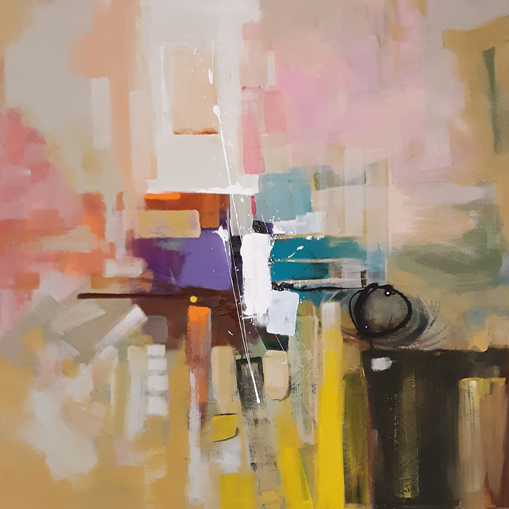
“Flavorable” – 36″x36″ Acrylic on Canvas – More detail
“Is there really a rainbow in the flavors of Good ‘N Fruity candy?”
Inspiration often hides in some very strange places. I was just checking out an artist’s work today on instagram who is inspired by women’s shoes (@shoesshucos). Manhole covers, rust, butterflies, the bible, you name it, an artist is inspired by it, propelled by it to make art. Inspiration sometimes gently nudges us to put brush to canvas. Other times it kicks us in the testicles. Inspiration can trigger an artist to use a new color scheme. It can motivate us to completely change our style from representational landscape artist to expressionistic abstract sculpture. Inspiration is both an ambrosia and an addictive drug, sometimes even leading an artist to extremely dark and problematic places for the mind and soul. The inspiration behind the next painting in the MOD! series was not of that flavor. It was candy.
Some of my favority childhood candies. Yum.
“Flavorable” just sort of burst onto the canvas, splashing its happy yellows and reds across the surface. The colorful “cells” ended up almost floating above the composition. Look Ma, I’m flying! The loosely, perhaps sloppily, drawn linear elements reflected a child’s loving approach to drawing where cleanliness of line and attention to geometric detail be damned. Warm and cool colors play tug-of-war near the center of the painting, hopefully drawing the viewer in to watch the competition.
Candy was more than a mere taste treat for me as a kid. It was a currency. It was Haute Cuisine. Candy was the Holy Grail gleefully received at the end of me and my buddies’ arduous quest to the candy counter at the local Goldblatt’s (pretty sure that store doesn’t exist anymore). Coming from a family of relatively humble means, my father was a cop, an honest one, which means not a boatload of illicit cash for mysteriously purchased swimming pools, and my mother who stayed at home to raise us kids, my allowance was also relatively humble. Candy was without doubt one of the very few purchases I wouldn’t second guess while spending the entirety of my weekly stipend. Halloween was certainly the highest of holy days. Well, maybe after Christmas. Okay, Halloween was my second highest holiday.
“Flavorable” reflected a maturing use of my newly acquired artistic signatures/gestures, my new mark making techniques. Everything from a light use of stencil, painted line work shot out of an emptied mustard bottle, focused dotted patterns, dry brush, wet on wet, a flicked squibbly line applied by dipping a stick into the paint jar and flipping it at the canvas, were all used to complete this painting. To date, “Flavorable” is one of my favorites of the series. And I still love it, which is far more powerful than just liking it.
It’s my adult artistic candy jar.
“Flavorable” – 36″x36″ Acrylic on Canvas – More detail
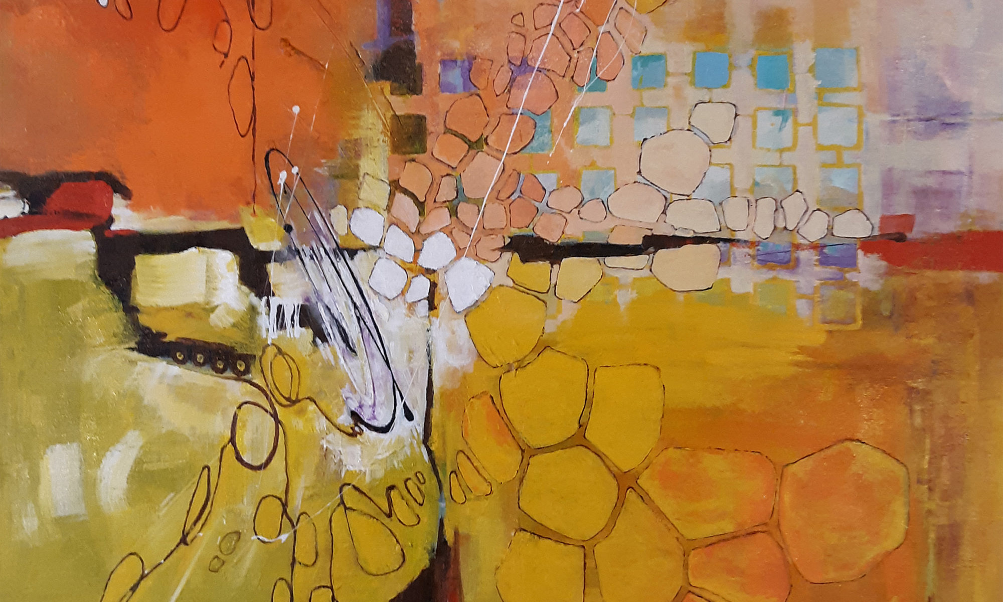
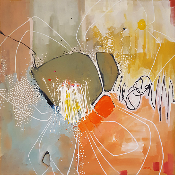
“Granite Fire II” – 36×36 Acrylic on Canvas – More detail
“I like stuff that blows up, so that’s what I paint.”
“Granite Fire II” wasn’t created from scratch for the MOD! series. It was a rework of an existing painting that I had completed ten years earlier. I should have taken a photo of the earlier state before the rework but I was lax in my documentation duties. I do have the 10×10 color sketch, however, which I will display below for comparison.
“Granite Fire” – 10″x10″ sketch
The larger 36″x36″ Granite Fire didn’t completely capture the innocence and the simplicity of the sketch, so it was ripe for rework. The stark, drab, grey background needed more excitement. The orange swath, while interesting, wasn’t bright enough for MOD!, and it, too, needed enhancement. The lonely brown framework reminded me of a dead tree so it needed some life injected into it. I really liked the large white smear near the center of the piece, as it felt like the paint was cascading down the surface, so I left it alone.
I wanted to explore some Gridularity (technical term I just made up) so I put it everywhere. Why not? I built a latticework of squares emerging out of the heart of the fire. I tried to emulate multiple colorful stone paths on the left-hand side of the composition. The net result is an almost obnoxious bombardment of shape and colors. For viewers who prefer subtle nuance and delicate tonal balances, this piece is not for them. It is loud, bombastic, and pretty much punches the viewer in the face.
The title of the piece reflects well my intention to juxtapose granite, an earth element, with fire, a not earth element. I suppose when granite is heated to a molten state one could say it’s on fire, but I really didn’t think the title through that far. I just thought it sounded cool, or hot as the case may be.
While Granite Fire II may not have been a purebred member of the MOD! series, I made sure to make the rework’s colors similar to those used in the paintings that came before it. Whether or not it rightly belongs in the series is hard to say, but I’m saying it does, so that is pretty much that, right?
“Granite Fire II” – 36×36 Acrylic on Canvas – More detail
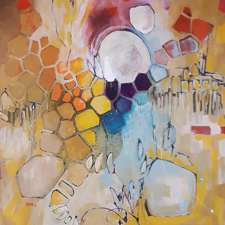
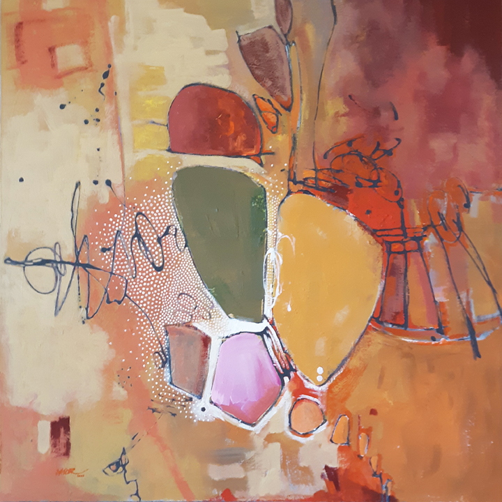
“My Q-Tips Are Blossoming!” – 36×36 Acrylic on Canvas – More Detail
“Is a painting’s title important? Ask the painting.”
Never quite knowing when to stop, I explored my newly acquired “skills” of doodled line work and dots even further in the next piece of the MOD! series. After laying in the initial composition and applying a wash of preliminary color, I needed a design element to counter the drab black of the linear framework, so I took a small bottle of white paint and hastily scribbled a shape near the center of the piece. The new element ended up having small ball like tips with thin semi-straight lines connecting them. “That looks like a bunch of Q-Tips”, I thought. Heyyy, I had half of my title. But half a title isn’t an entire title, so I needed more. What is special about Q-Tips? Certainly not what they are used for, which is just about anything. Their shape? Their color? Not exciting. What if I placed the Q-Tip in a hostile or a non-Q-Tippish environment? What if Q-Tips were alive? What if I MADE Q-Tips alive? What if they were not only alive, but growing? What if they were not only growing but they were flowering? Perfect. I had my full title, “My Q-Tips Are Blossoming”. A little weird, but kind of funny and certainly on the thought provoking side.
“Ecstasy” – 1930 Maxfield Parrish for Edison Mazda Lamp calendar
The color scheme would be loosely based on a Maxfield Parrish poster from 1930. While Parrish was most certainly NOT a “modern” painter, I’ve always been fond of his use of sky blue and orange. That color combination and Parrish’s use of it has stayed in my memory from my days at Art School (School of the Art Institute of Chicago, I’m such the name dropper) back in the early 1980s. Funny how some things imprint upon us so strongly. I must have been really smitten by Parrish.
The application of the dot highlights took longer than I expected. While many artists use paint pens to make their dot patterns, I wanted to use a small brush better to control the size and shape of each and every dot. That might be giving my concentration a little too much credit. I’m sure I wandered off a few times to think about important stuff like Arsenal games and new releases of dubbed Anime. So I’ll rephrase that and say I wanted to control the size and shape of most of the dots. Some I just didn’t give a shit about.
The addition of the white linear “petals” was the last piece of the puzzle. I wanted to surround the large shapes in the center and turn them into an abstracted flower. The white line brings the entire surface back into play, allowing the more prominent shapes to stretch out toward the edges.
“My Q-Tips Are Blossoming!” is a playful interpretation of what my idea of a “modern” painting is supposed to look like. It has areas of expressionism, a peculiar geometry in other places, is bright, and has a slight attitude. I wonder what will come next?
“My Q-Tips Are Blossoming!” – 36×36 Acrylic on Canvas – More Detail
“I want this painting to make my sofa look expensive.”
“1964” was the first piece created specifically for the “MOD!’ series. I enjoyed role playing as a practicing artist in New York during the mid 20th century. Really. I pretended I was there. I listened to Dave Brubeck’s “Take Five” to help get me in the proper mindset. Do I often use music to inspire my art? No, not often. Music has its own unique visceral embrace, its own set of rules. If the visual artist isn’t careful, it can splatter all over the canvas.
I did a lot of research and sought out work by the NY Abstract Expressionists. As impactful as these artists were, to be honest, there wasn’t a hell of a lot of consistency between them. If I could choose a word best to describe the work, it would be “BOLD”. After days of study I decided the three best artists of the group, the three that influenced the general tone of the movement (for me of course, I’m no art historian) were Hans Hofmann, Franz Kline, and Jackson Pollock. To me, their paintings epitomized and encapsulated where this group was trying to go. Their work is brazen, novel, and dares the viewer to take a chance on liking it.
Song of the Nightingale
Butress
Summertime: Number 9A
I definitely was not going to mimic the work of others in this series, but instead, I wanted to infuse my work with the flavors of each of these three. I let my color choices be steered by Hofmann. I would learn from Kline’s compositions, balanced designs unshackled from traditional still life or landscape models. Pollock’s freedom of line, his energetic explosions of scribbles and flicks that send the viewer’s eye wandering across the surface would help make my piece dance.
Dots. I needed dots. I have no idea why I thought my work needed dots, but it did. The array of tiny dots across the canvas in key locations bring specific areas of the composition to the forefront. This was also the first piece where I used this new ‘signature’ . Tedious to apply, certainly, painstaking even, but as a highlight, this new mark making technique would continue to be used in subsequent pieces.
So why 1964? I was four years old at the time. For some reason, this year feels like a turning point in society. It feels like it was a moment that marked an old guard being replaced by the new recruit. The day of the beatnik was at an end and would soon be replaced by a youthful and energetic wave, the next step in Modernity’s natural evolution.
“If the end result doesn’t hint at the process of making it, it has failed.”
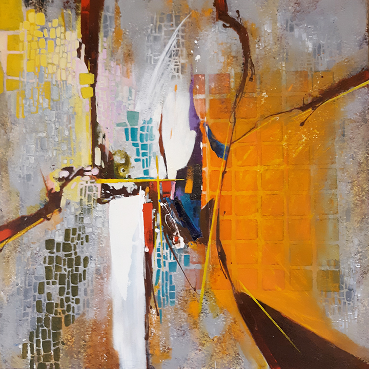
The second piece I worked on as a newly established full time painter in 2020 took some of the organic “cell” shapes from ‘Foment’ ( this term ‘cell’ was from an old friend’s comment on the work. I had no idea what he was talking about at first) and pushed it even further, perhaps too far. I’m still evaluating this even now. “Maelstrom In Blue” nudged me into seriously unknown territory, and I was incorporating stencils, dry bush techniques, wet on wet applications, warm and cool color combinations, and even new mark making ‘signatures’. I titled the painting after it was finished, and I tried to reflect some of the craziness I was trying to inject into this work into the title. I had a hard time knowing when this was finished, and even ended up sharing the piece on Facebook to try to get some of my “friends” input on it.
Three separate states of completion for maelstrom.
Each time I tried to hang Maelstrom on my kitchen wall I ended up taking it down and going back into it. This must have taken place at least five times. Apparently I was really eager to get this painting finished, but its completion kept giving me the finger. There is a very intimate relationship/correspondence between an artist and the ongoing process of Art that’s becoming Art. It’s even possible that artists do not make art, but Art chooses the artist to bring it to life.
Finally I felt I could put the brush down, and was pleased by the result, though this contentedness would be relatively short lived. Maelstrom In Blue is still one of my least favorite pieces of early 2020, though I’ve had many comment that it is amongst their favorites. I really am quite a terrible critic of my own work.
Upon hanging the painting on my wall, inspiration happened. While I was ogling the result now staring at me from its kitchenian hallowed space, I asked myself “What would Hans Hofmann think? Would a Helen Frankenthaler give this a thumbs up?”. I then got the idea for a series of works that would be based on my interpretation of Abstract Expressionism, the New York School, during the mid 20th century. I loved those girls-mostly-guys! I would call it my “MOD!’ series, a collection of 36″x36” paintings that basically defined my output for the first half of 2020.


